Sunday, November 26, 2017

Federal Taxes by Income


Federal Taxes

The proposed change in tax policy by the republican congress is currently short on details.  I was surprised by how much benefit they are looking to provide to a small sliver of Americans at the expense of everyone else.  The IRS provides statistics on tax returns so citizens and journalists can verify claims made by all sides.   The latest tax year  currently available were for 2015.

let me take you through a few summary views that hopefully put this in some more useful context.   The graph and table below shows you the percentage of returns by income level and what % of total income is generated in those income bands. (I collapsed the income bands for under 100k and for 1 million to 10 million - you can expand to see the details by hovering over the axis where the values are and clicking on the+ button)

For example:
51% of the returns are for income less than 100k and this represented about 16% of all taxable income in 2015.  (21 million plus returns)

at the other end of the spectrum

.04% of returns (17 thousand returns)  were for people making more than 10 million dollars in 2015 and that was responsible for about 9% of taxable income.


In other words 17 thousand returns (families) generated almost half the income as 21 million families


Wednesday, October 5, 2016

Why School Enrollment Changes Matter - an analysis of school attrition.

The intersection of school funding, curriculum development and enrollment creates a difficult mix of information to understand.  I propose that enrollment trends and attrition should be a fundamental key performance indicator to evaluate to the health of a district.

Student enrollment is a simple way to measure if your initiatives and educational goals are resonating with families with children in school and those looking to educate their children in your district.   

Currently using business models is in vogue when discussing about education. To be honest, a true business point of view would be to look at schools as a "research and development" division - an area in need of investment without being a profit center. The one are a business approach may be helpful is thinking of students as customers. If we think of them as people who come with a certain amount of state aid and the becomes the district's revenue. 

Each district has it's own spend per student ratio. The cost to educate the typical student is not the same as the amount of aid received. The majority of school costs are largely fixed in staff and buildings. That means, how much it costs a district to educate all children across buildings and classrooms is broken down into a per student cost. 

For example if your per pupil expenditures are $12,000 a student, adding 2 more students to a class of 18 does not increase the cost of running that classroom or school by $24,000. In fact, you're spreading those fixed costs over more students who are bringing state aid. This increase in funds can bring opportunity to improve offerings and hopefully attract more students.

The reverse is also true, but more problematic. If you have a class of 20 and two students decide to leave, your costs do not go down by $24,000.  The fixed costs now need to be covered by the remaining 18 students. With fewer students, you're increasing your per pupil costs and may potentially have to reduce offerings which hurts the ability to attract and retain students.  


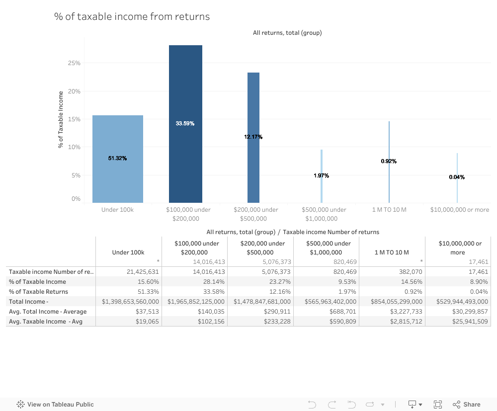
If we divide the Chapter 70 aid we receive locally by total enrollment, we get about about $3,500 a per student.  

This means, if a graduating class starts in 1st grade with 200 students that would equal  $8.4 million in aid over the next 12 years.

If  20 of those students leave in 6th grade, that is a loss of $400,000 in revenue over the remainder of their school careers. It's a difficult sum to make up through cutbacks that do not affect students.

We can look at some real world examples locally.


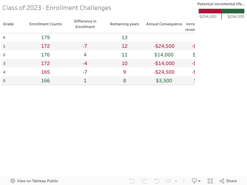
The graduating class of 2023


Enrollment went down 7 students between K and 1st grade. Each of those students were worth about $3,500 a year in state revenue for the next 12 years. That is about $300,000 in lost revenue over that graduating class' career just from that one drop in enrollment.  

The next year 4 new students enrolled to that class. Those students bring an additional $154,000 over their customer lifetime if they remain in district.  

The same class lost 11 students in 3rd and 4th grade. The enrollment aid that we lost with those students is over $350,000 through the remainder of this high school graduating class' educational experience in our district.  


Class of 2019


Saturday, September 24, 2016

MCAS Trends by Gender - Amesbury

Sunday, September 11, 2016

Amesbury Schools Enrollment Trends

Amesbury School Enrollment Trends

Enrollment = total number of students in the district  
Attrition = number of students who do not return to a district


Both numbers are calculated as of October 1st of a school year. The Enrollment number will tell you how many students are in a grade or district for that year. Attrition will tell you what % of students who were in the district last year are no longer in the district. 

For example if there were 100 students at the end of the year in 5th grade and 90 of those students were enrolled in the same district the next October then the attrition would be 10%.  If 6 other students moved in then the total enrollment for that grade would be 96.   The enrollment would be down by 4% but there would be an attrition of 10%. 


Enrollment and Attrition trends can provide an initial lens into the overall health of a district.

  • Enrollment - Are parents choosing the district when they are buying a house or renting an apartment  -Is that indicated by increasing overall enrollment in early grades?
  • Attrition - Are parents and students choosing another school?  Are we seeing spikes in attrition rates in certain grades? 
  • Are there trends by subgroups? - Graduation Year, Gender, High Needs?
Why is this important? 

How to use the following tool  -


  1.  select a graduation year from the 'graduation year' drop-down menu. for example select - 2019 you will see the following -
    1. the class had 182 students in 2nd grade, 194 in 6th grade and 147 in 9th grade.
    2.  The bar charts below show 23% in green.
    3.  This equals 23% of the 8th grade class did not go to the high school
    4.  Is this aligned with typical attrition rates?
  2. go to 'grade level' filter at bottom of tool and select 8th grade  to look at 8th grade attrition trends
    1. you will see a range from 8% to  17% attrition in the previous 6 years. 

You can repeat the process for other graduation years or grades and to identify positive or negative trends. We can then start to ask questions about why certain trends are happening. 


Sunday, September 6, 2015

Electoral College by region

Summary of Electoral College votes by region


Tuesday, June 4, 2013

Chapter 70 inequities and changes since 2000

Chapter 70 is a Critical Piece of Municipal Finances

School budgets represent the largest single expense for a city and town and a key piece of this funding is Chapter 70 which I summarized in another post.

The formula is intended to develop equity between cities and towns, but upon looking at the trends, this equity does not appear to be happening in my hometown of Amesbury.

Since Amesbury has been on the losing end of Chapter 70 reimbursements, considerable strain has been put on our local finances and our local tax rate. While we continue to serve an increasingly diverse school population, the money we receive from Massachusetts has gone down. At the same time many cities and towns have seen dramatic increases in state funding.

In my professional life I help companies organize disparate data sources to build a coherent strategy. One of the first steps involves looking at trends to see if everything simply "makes sense." When I look at the range of Chapter 70 changes since 2000, it doesn't make sense.

The data for what Chapter 70 money cities and towns have received is available on the Massachusetts Department of Revenue website. The data is not  well organized for looking at annual trend data between municipalities. Trend data is available for individual towns or comparative data for an individual year. I chose to aggregate the comparative data for individual years and begin some analysis.


Six Cities and Towns out of 192 received less Chapter 70 dollars in 2013 than 2000


It is difficult to believe that only 6 cities and towns received less Chapter 70 aid for education in 2013 than in 2000. In looking at the list, these would not be the communities one would select if common sense were being applied..

When I look at problems like this for clients, I identify a few possible causes for outliers that don't make sense when compared to goals.

  1. The data is wrong
    1. someone entered wrong information in one of the input fields
  2. The formula/logic is wrong
    1. the assumptions used to build the formula are not aligned with the goal


The top 10 Cities and Towns with Largest % increase since 2000


What does this look like in total dollar changes fore each list


Aggregate Change Since Fiscal Year 2000


This table shows the total Chapter 70 changes for communities receiving between 1 million and 16 million in Chapter 70 Aid.  As you can see the total available dollars for this group increased by 15% and the average increase for an individual town was 28%.


Learn About Tableau